Brochure
Cake Pop Shop Branding
A comprehensive branding project for a cake pop shop, including logo design and brochure creation that showcases visual communication skills and brand identity development.
Project Overview
This project involved creating a complete brand identity for a cake pop shop, including logo design and brochure creation. The goal was to develop a cohesive visual identity that communicates the shop's personality and appeals to its target audience.
Software
InDesign, Photoshop, Illustrator
Role
Brand Designer
Type
Mock Client Project
Duration
Fall 2023
Client Interview
To kick off the branding process, we conducted an interview with a mock client to gain a deeper understanding of her cake pop shop. Through this discussion, we explored her business background, vision, and concept for the shop, as well as her expectations for the brand identity.
We also gathered insights into her products, menu offerings, and specific design requirements, ensuring the branding aligns with her unique style. Additionally, we identified her target audience, helping us craft a visual identity that resonates with the right customers and effectively communicates the essence of her business.
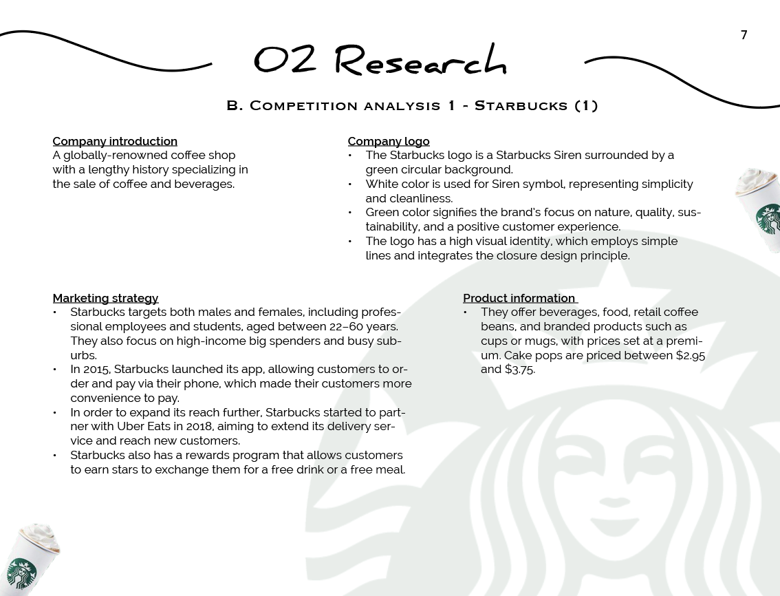
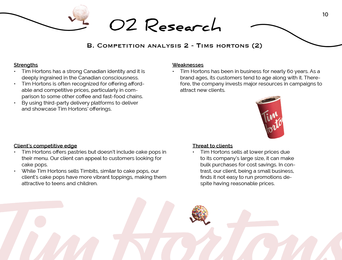
Competitive Analysis
To understand the market, I analyzed Starbucks and Tim Hortons, looking at their branding, menu, pricing, and customer experience. Starbucks stands out for its premium branding and loyalty programs, while Tim Hortons focuses on affordability and accessibility.
By identifying their strengths and weaknesses, we gained insights to help the cake pop shop carve out a unique brand identity.
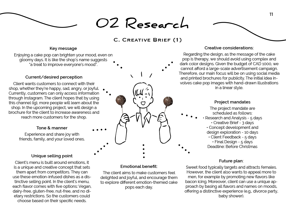
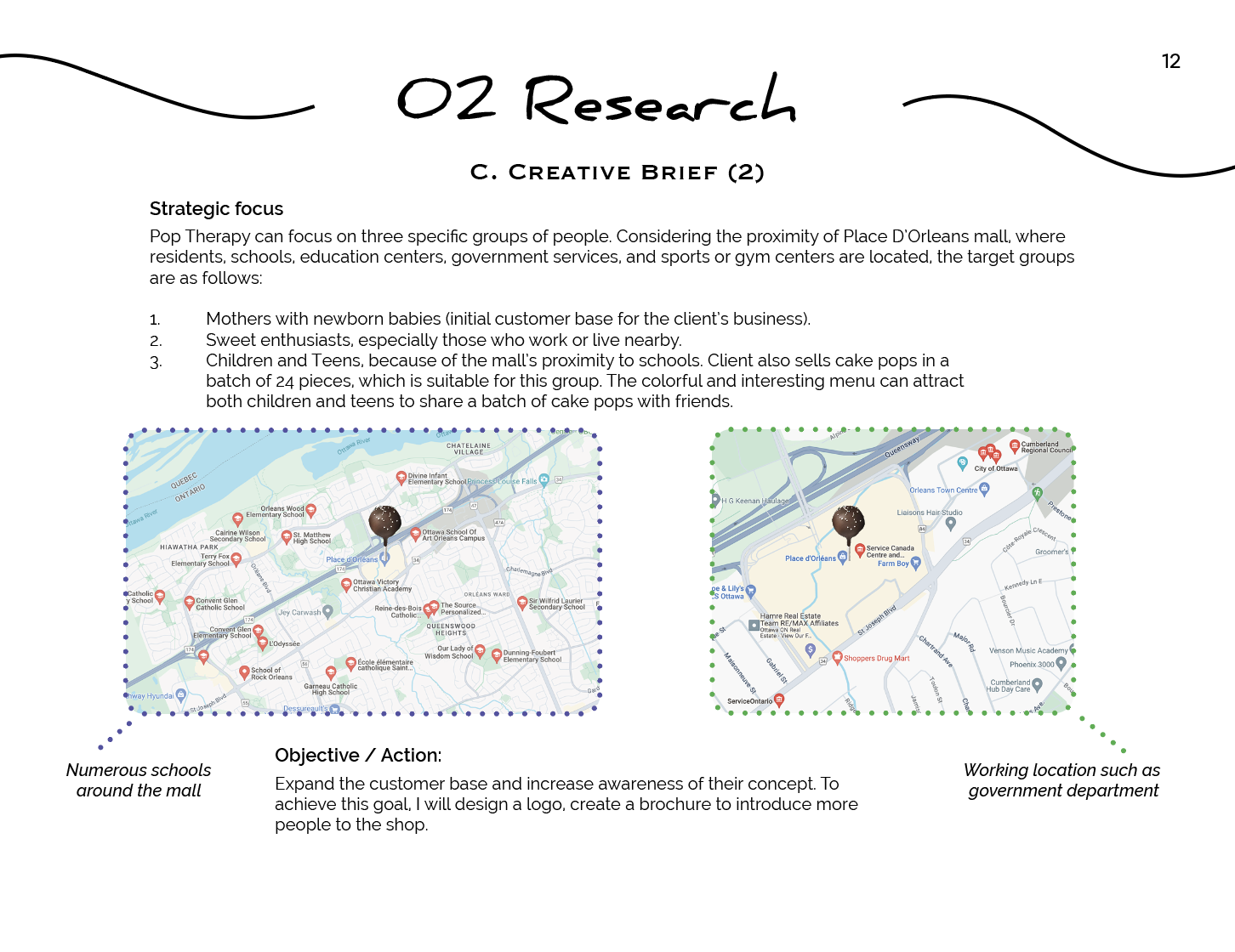
Creative Brief
After researching the market, I developed a creative brief to outline the brand's mission, values, and design direction. This helped define how the cake pop shop should look and feel, ensuring a consistent and memorable identity.
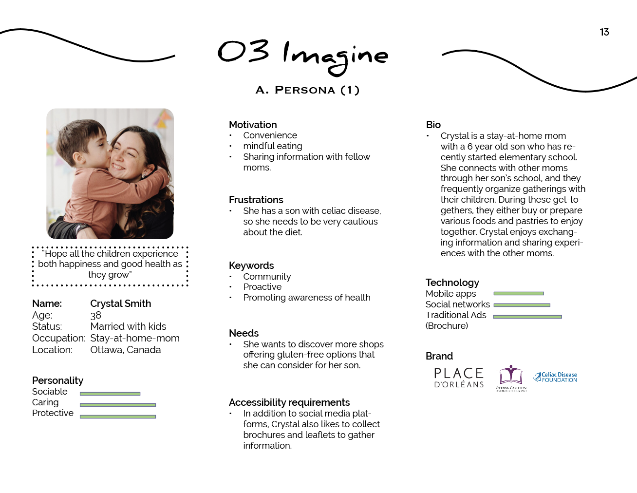
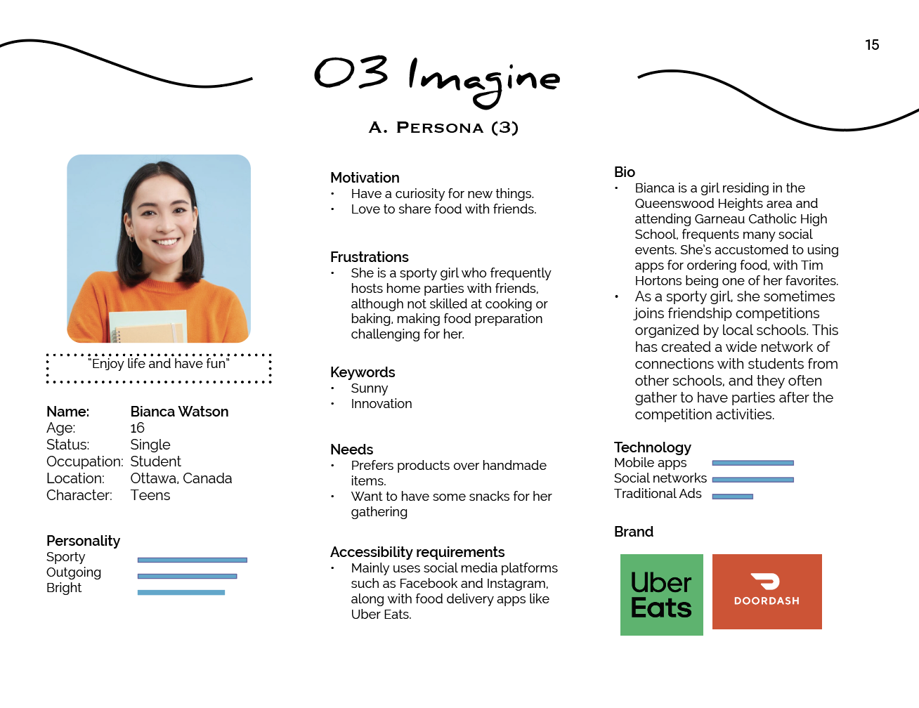
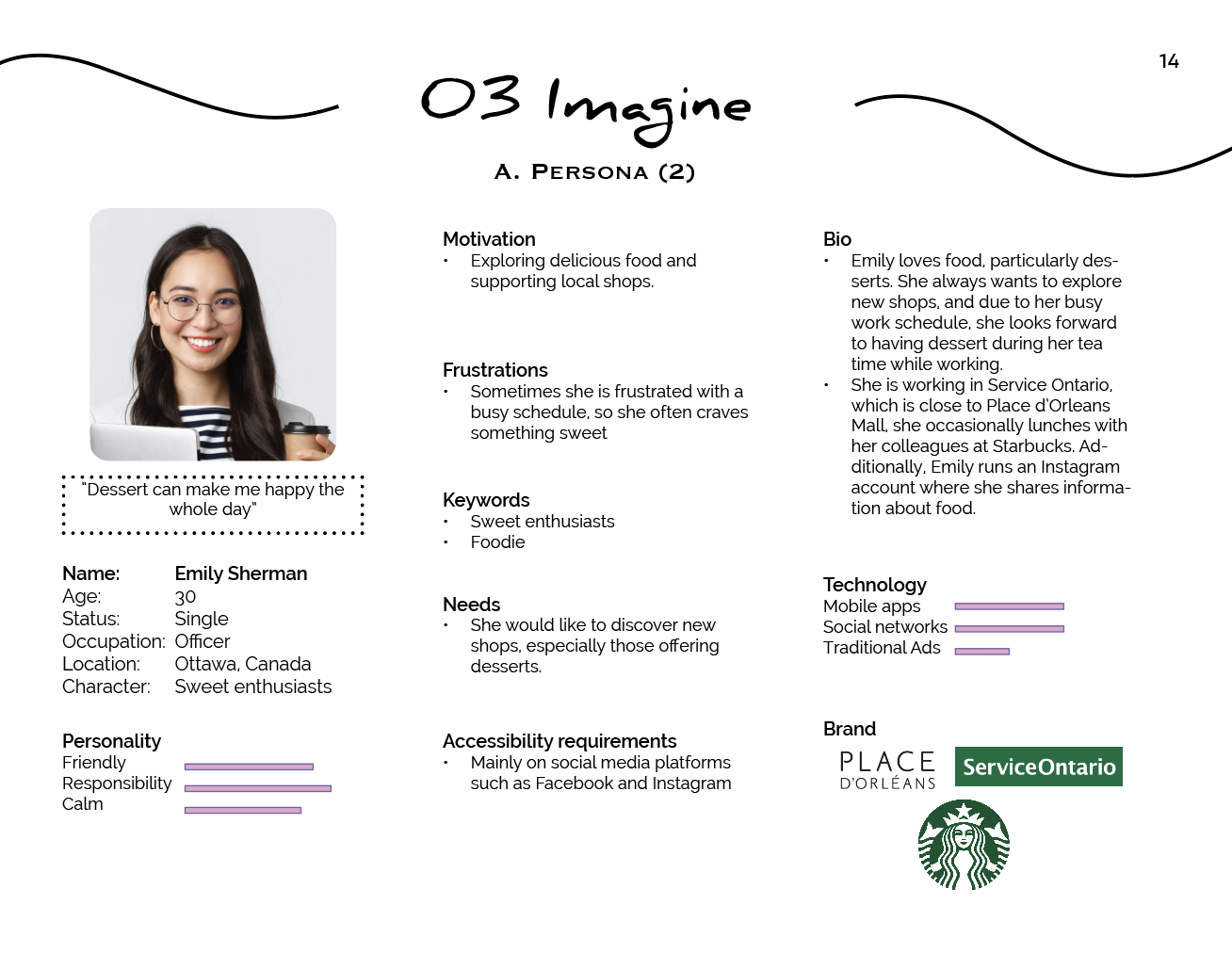
Persona
I also created a persona to represent the ideal customer, considering their age, lifestyle, and preferences. Understanding the target audience helped me make design choices that would appeal to them, from color selection to branding tone.
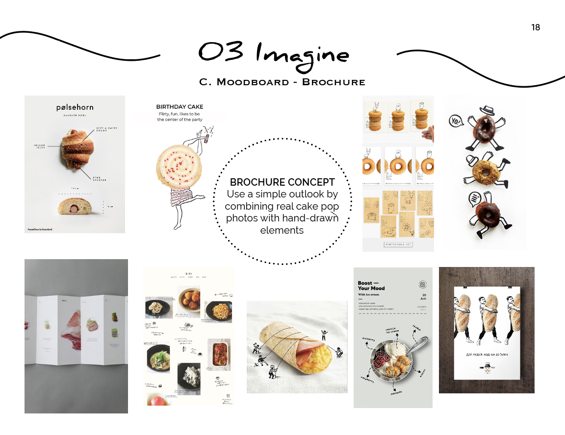
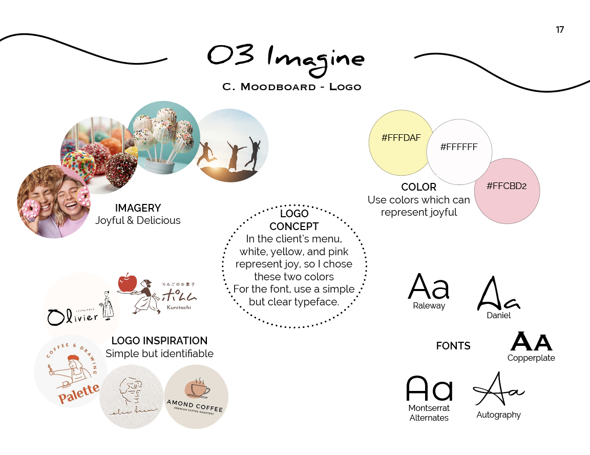
Moodboard
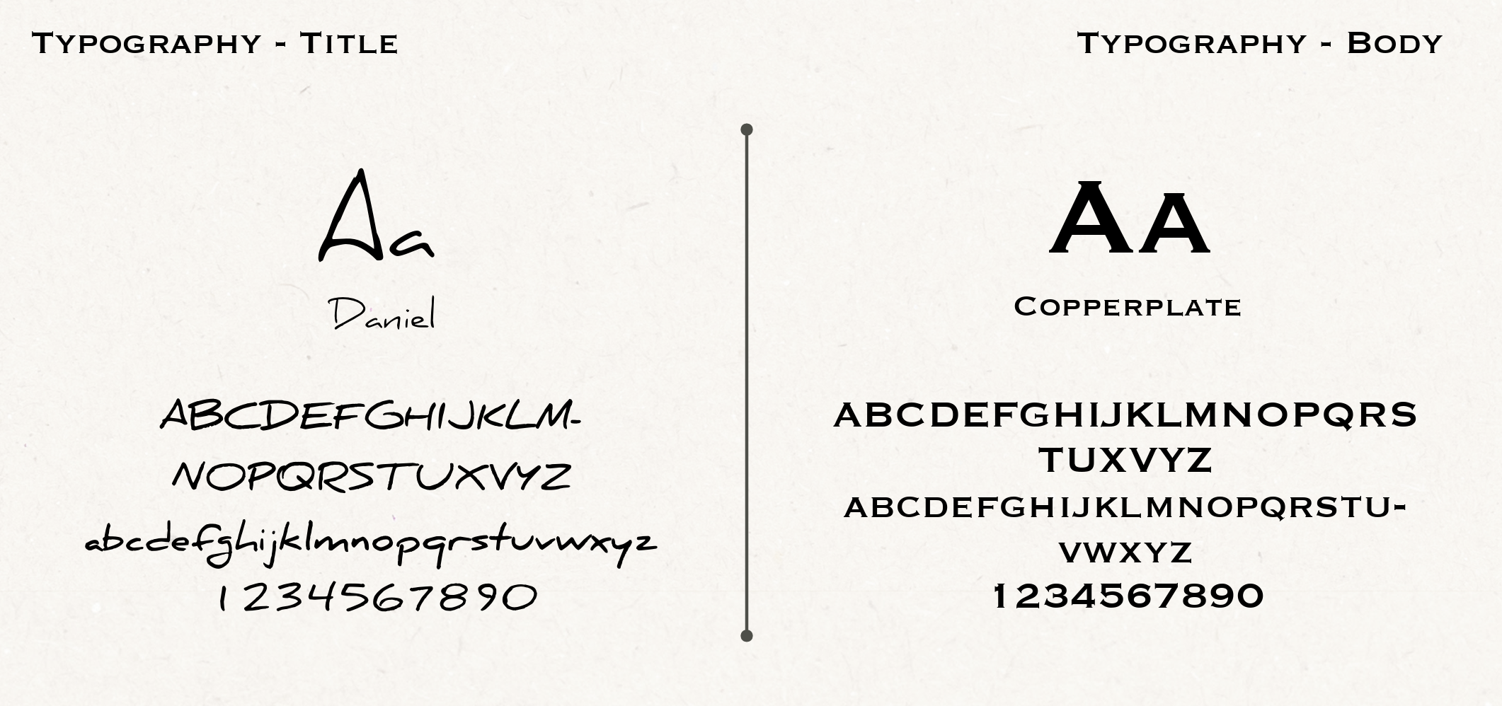
To establish a clear visual direction, I created a moodboard for both the logo and brochure, helping to define the color palette, typography, and overall aesthetic that best represents the cake pop shop's brand.
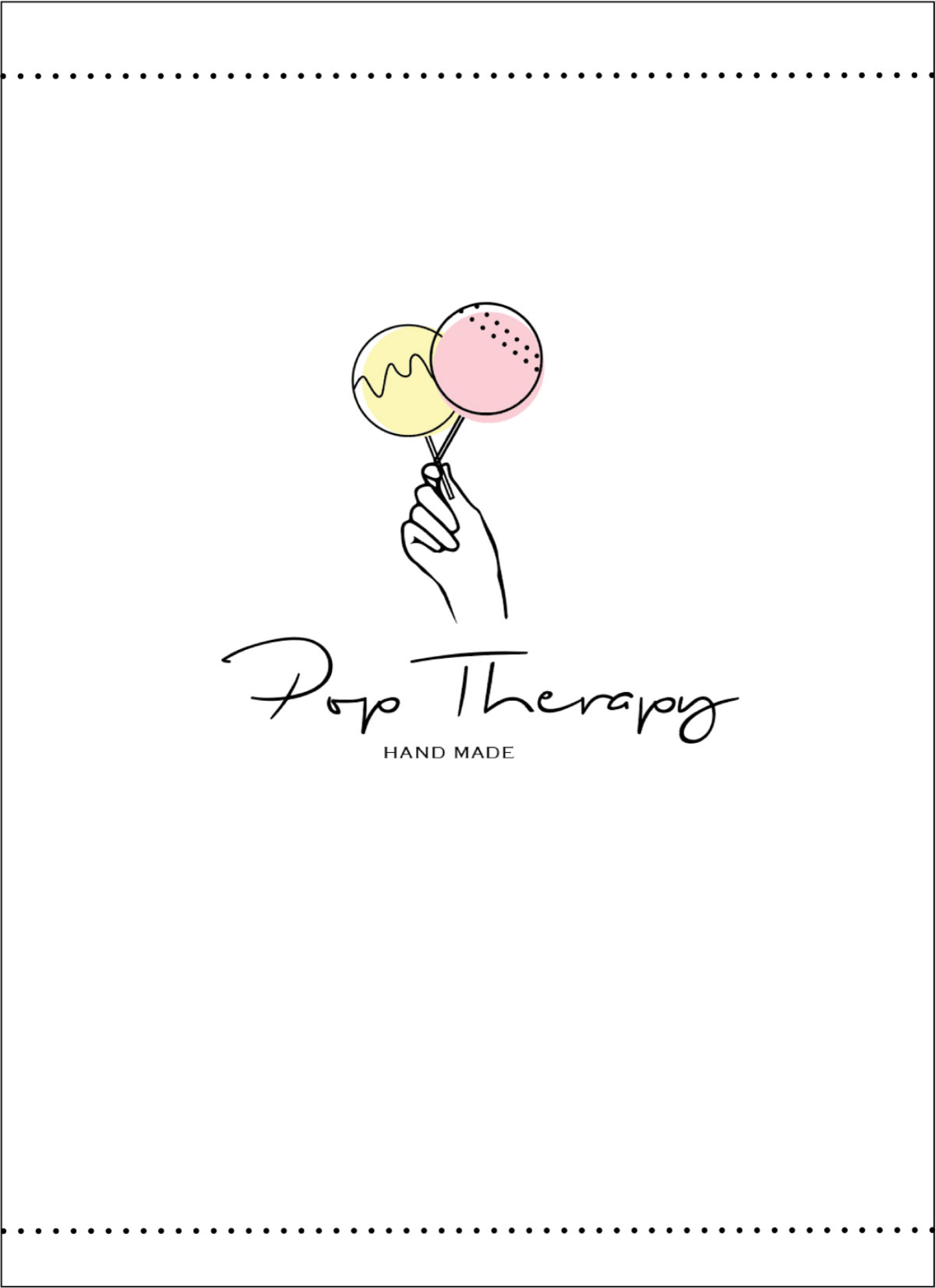
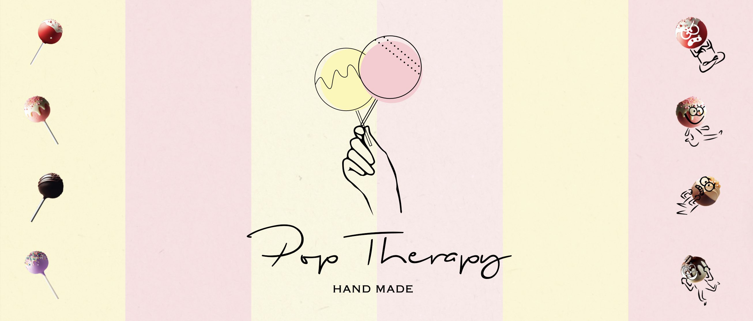
For the logo, I drew inspiration from the client's menu, where white, yellow, and pink symbolize joy. I incorporated these colors to create a warm and inviting feel. For the typography, I chose a simple yet clear typeface to ensure readability while maintaining a playful touch.
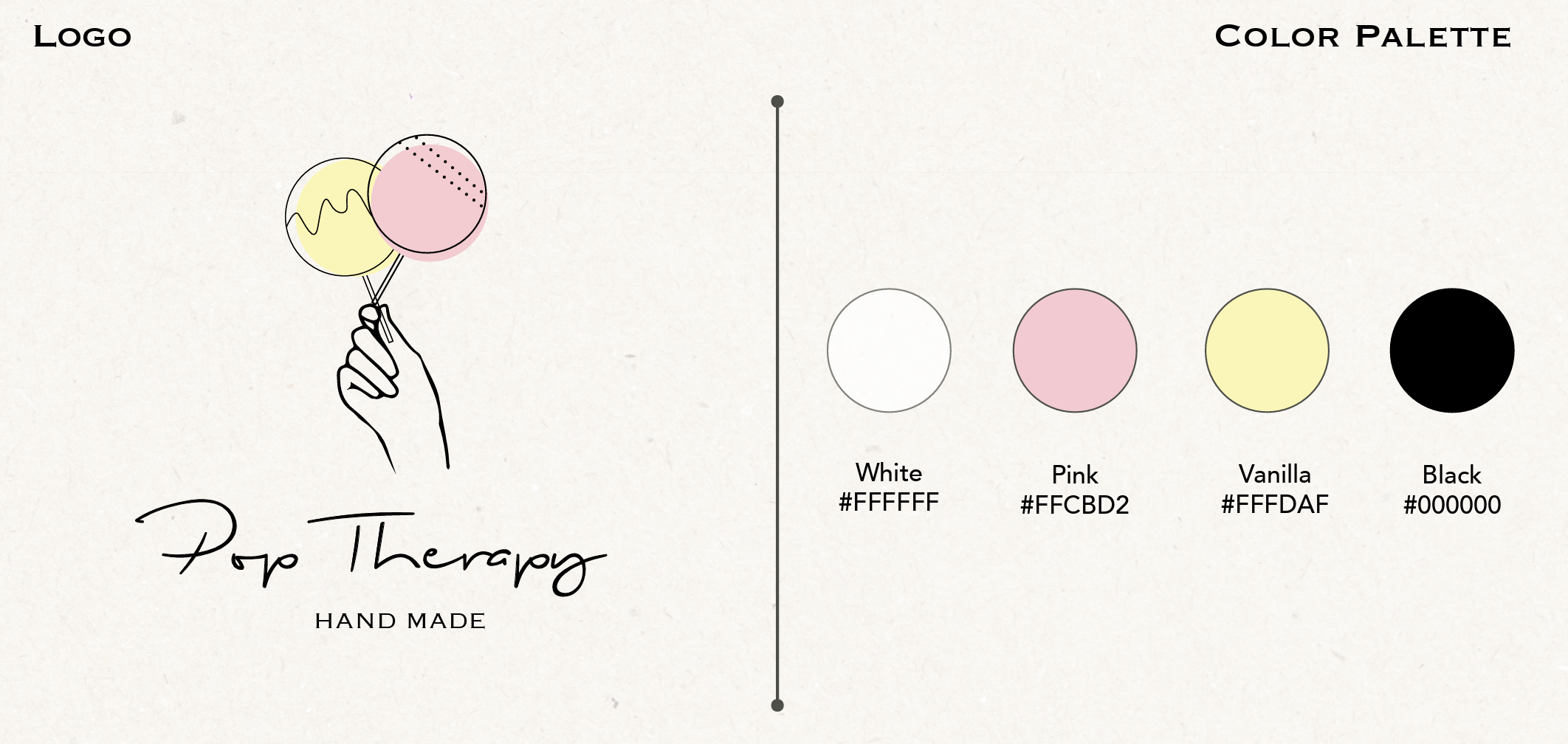
Logo Design
My logo concept conveys the joy of eating cake pops. In the client's menu, white, yellow, and light pink represent happiness and a good mood, so I chose these colors for the cake pops. Using a hand to hold the cake pops symbolizes happiness and joy. For the shop name, I chose black to keep it simple and clear for printing on brochures.
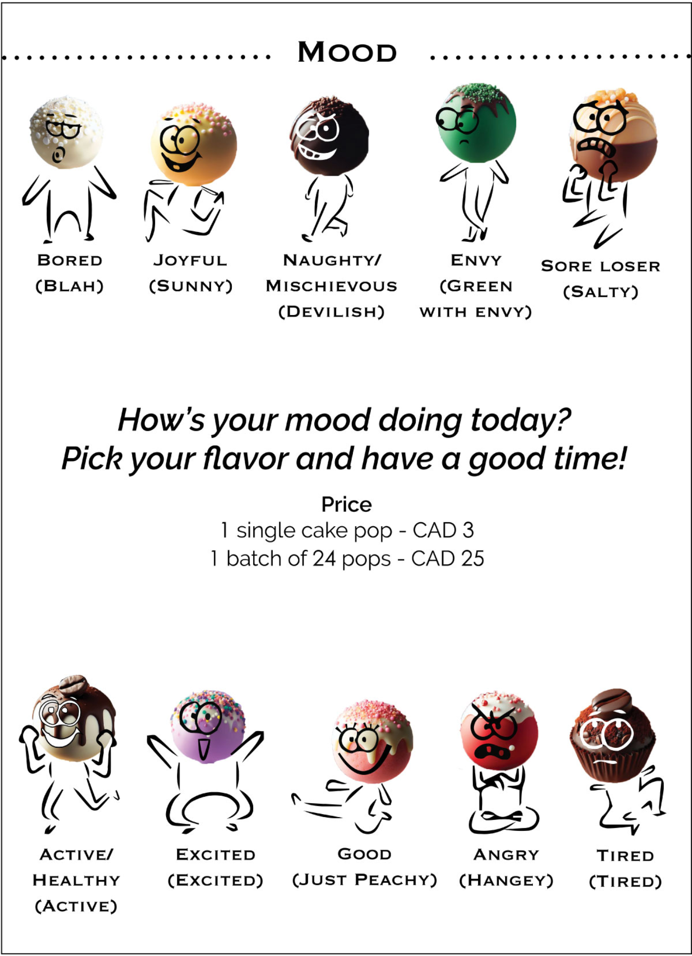
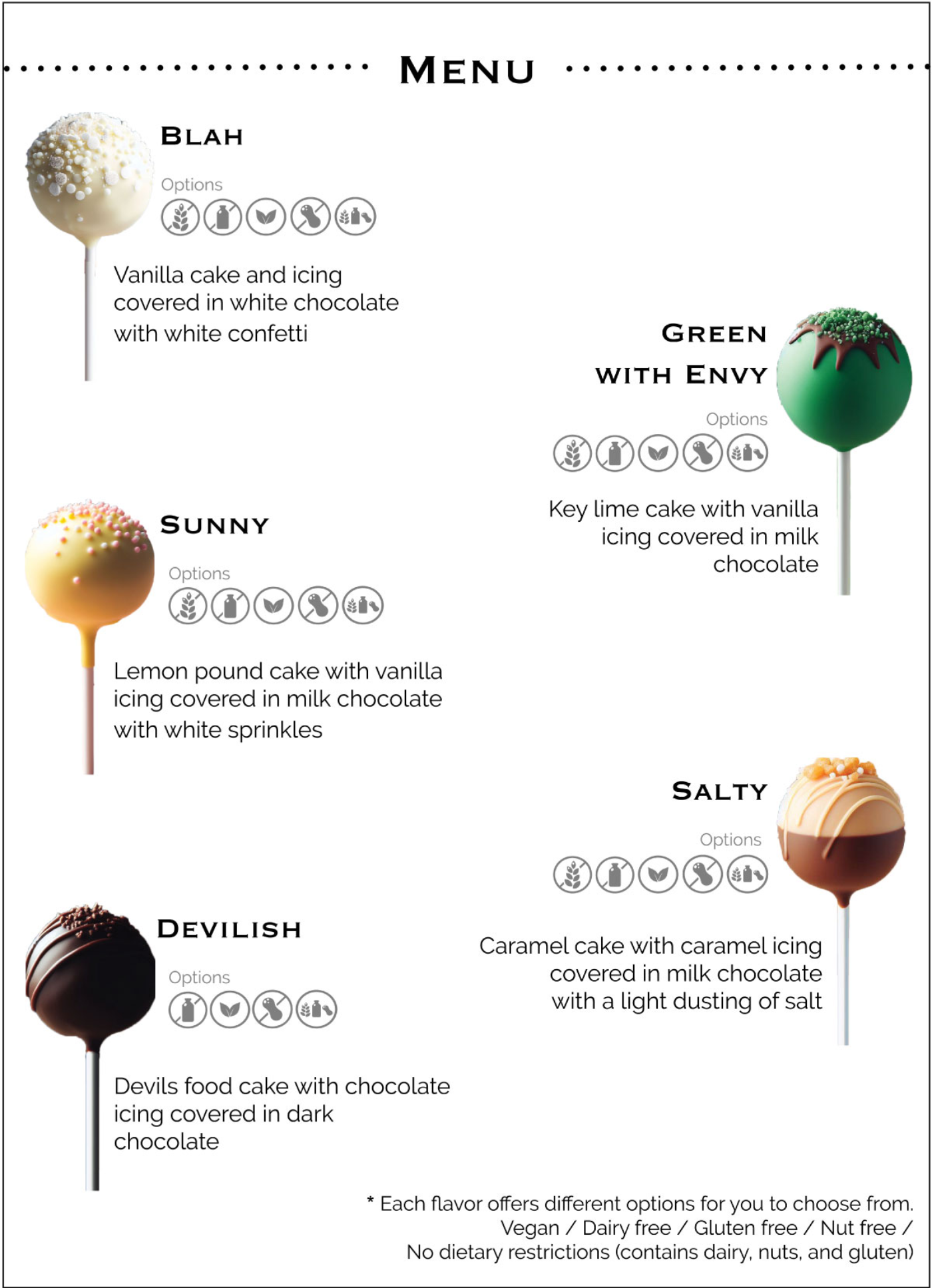
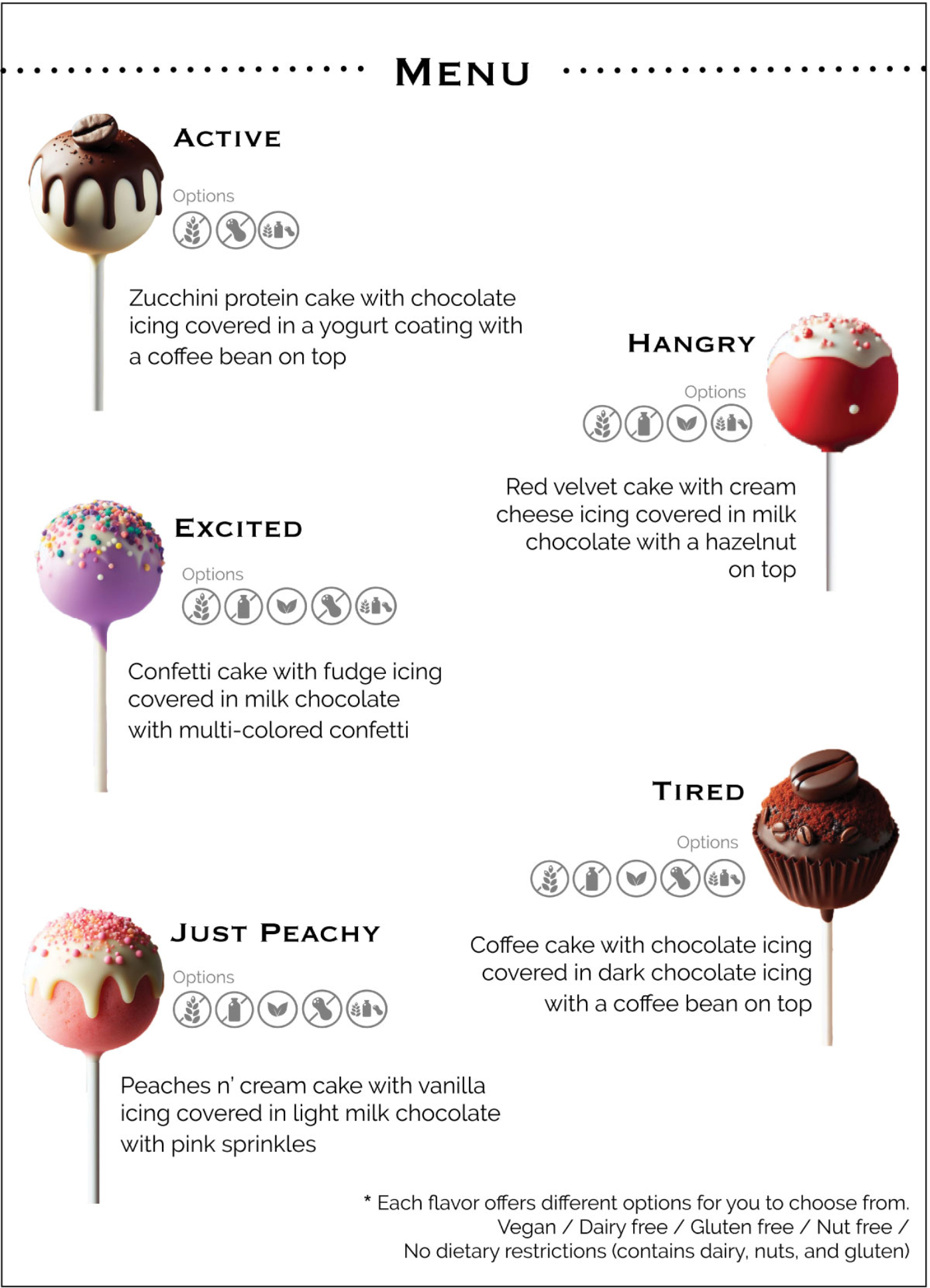
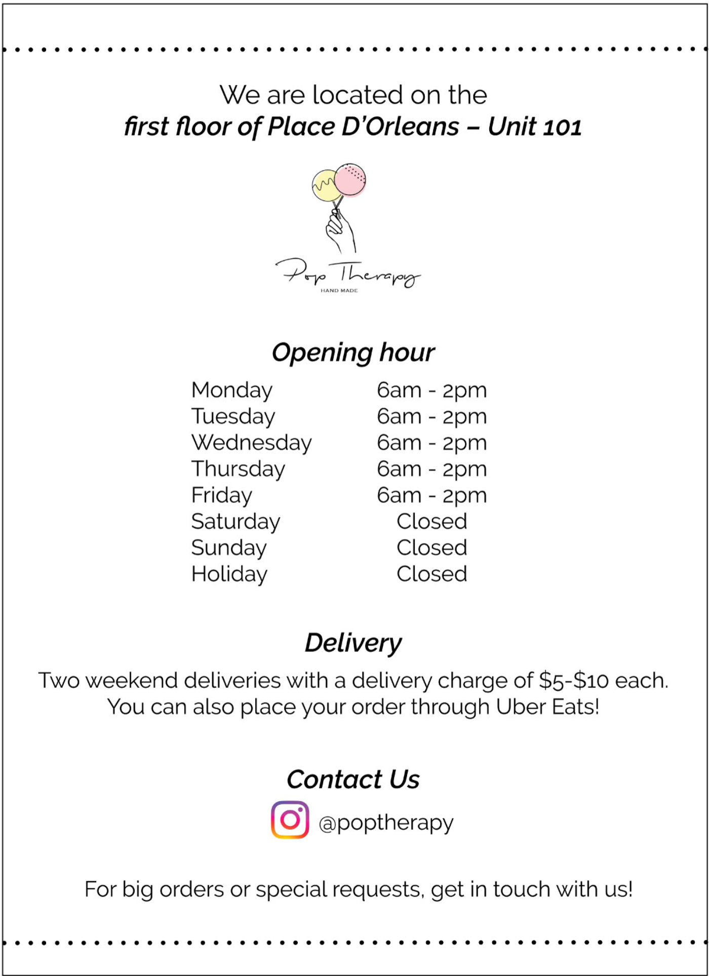
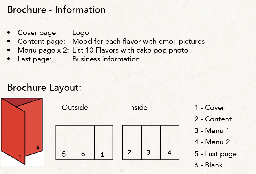
Final Brochure Design
The final brochure design is clean and visually engaging, combining real cake pop photos with hand-drawn elements to create a warm, inviting, and playful brand experience.