Tripagog
Website Redesign
A real-client project redesigning the current marketing website of Tripagog to attract visitors and encourage them to download the Tripagog app, ultimately contributing to business growth.
Project Overview
This project is about redesigning the current marketing website of Tripagog to attract visitors and encourage them to download the Tripagog app, ultimately contributing to business growth.
Software
Figma, Maze, Adobe Illustrator
Role
UX Research, UI Design, Team leader
Team
3 people
Duration
Winter 2025
Competitive Analysis
For Tripagog, we analyzed direct competitors (Wanderlog and Tripomatic) and indirect competitors (Tripadvisor and Kayak) to identify industry trends and gaps. This helped us refine Tripagog's unique value and enhance the user experience.
Problem Definition
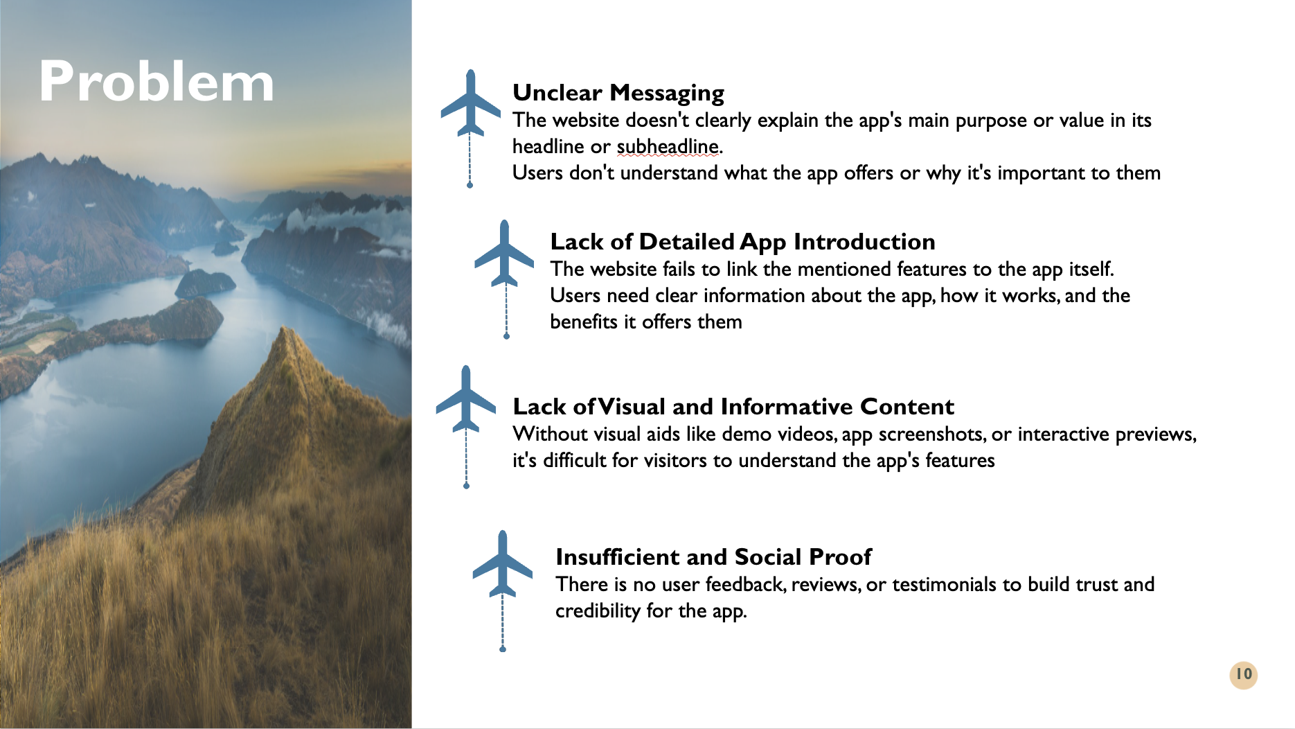
Our analysis revealed key issues with Tripagog's website, including unclear messaging, a lack of detailed app introduction, and insufficient visual content like screenshots or demo videos to showcase features.
Additionally, the absence of user reviews or testimonials makes it harder to build trust and credibility. These gaps create confusion for visitors, making it difficult to understand the app's purpose and benefits.
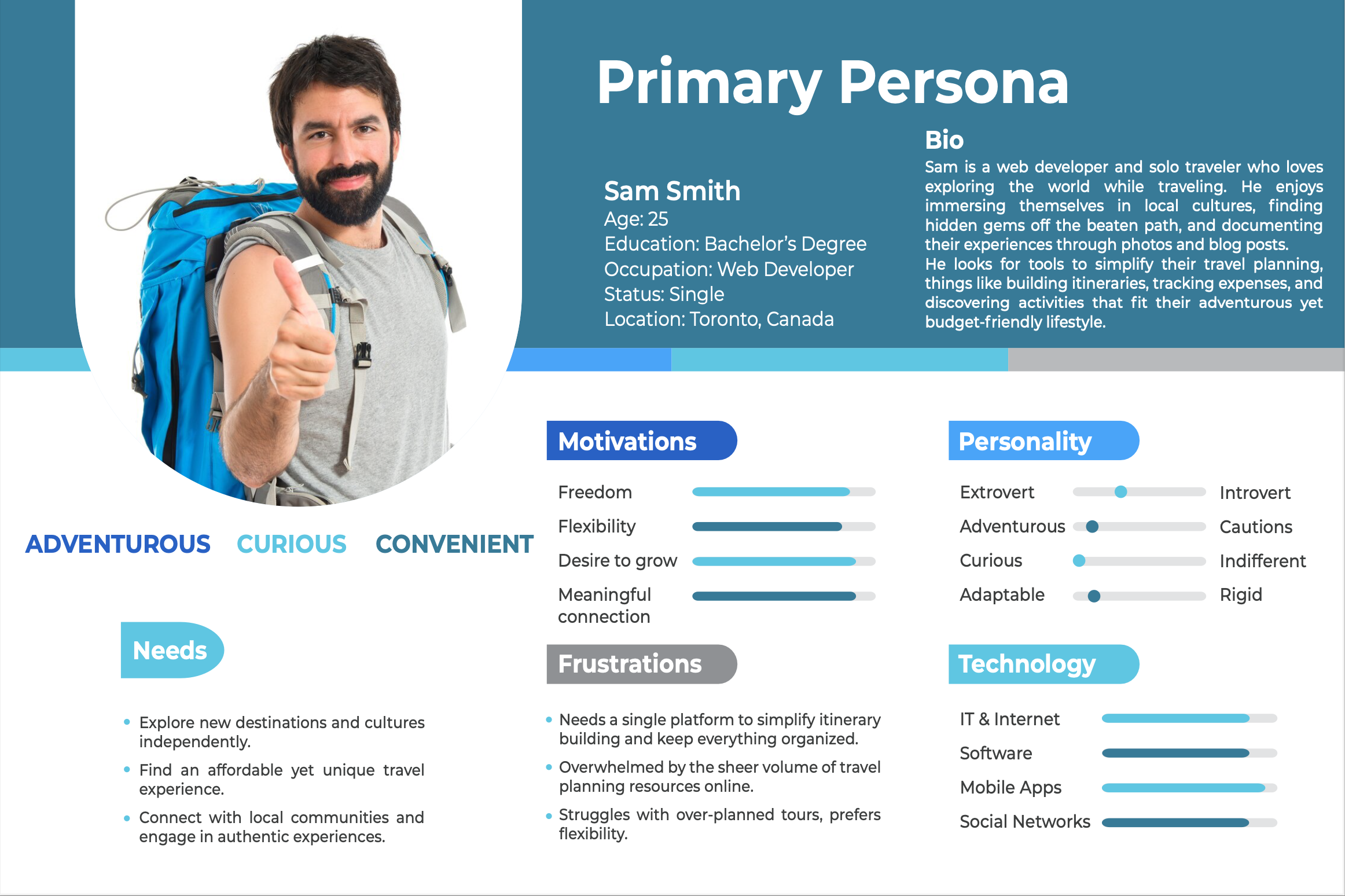
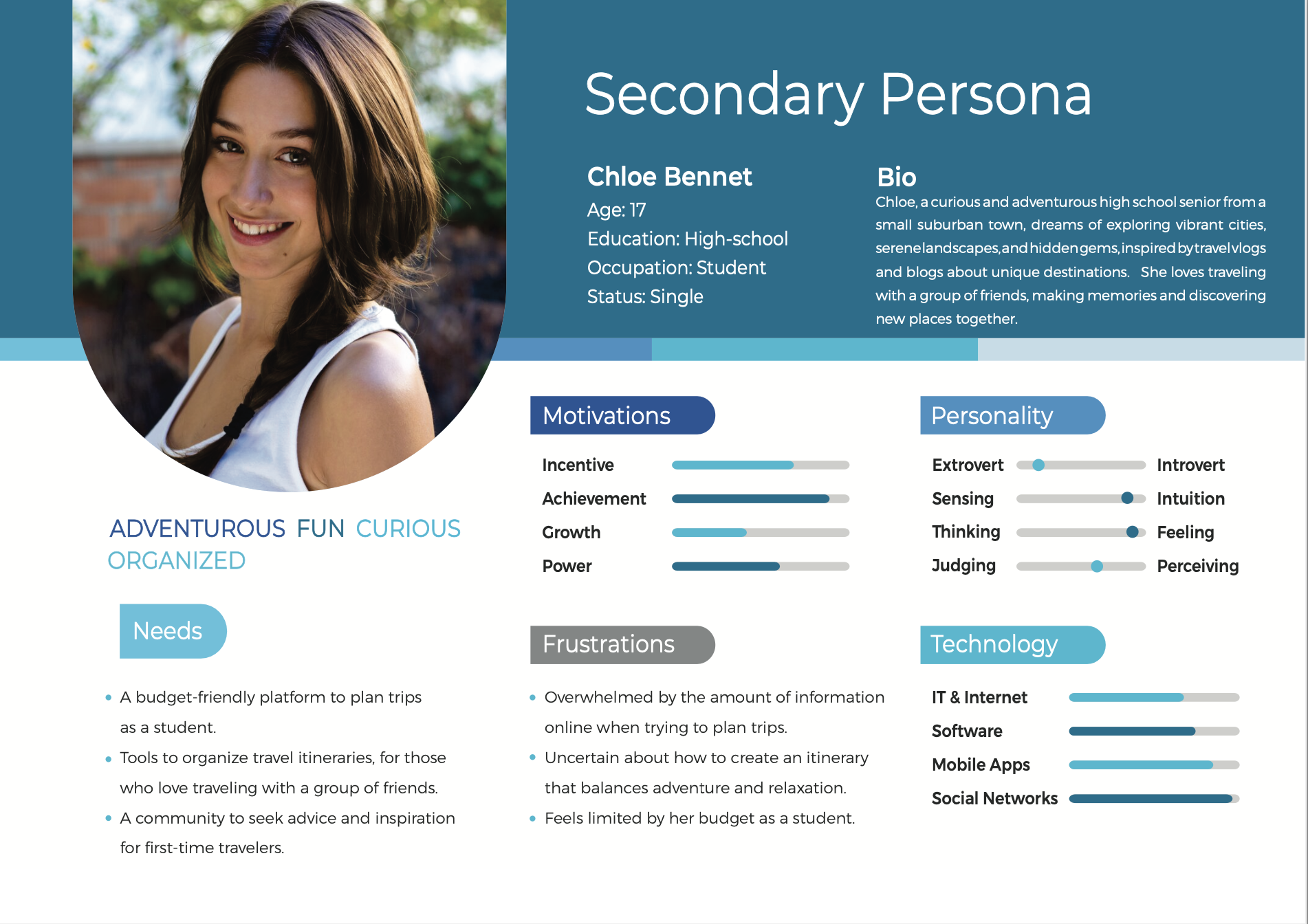
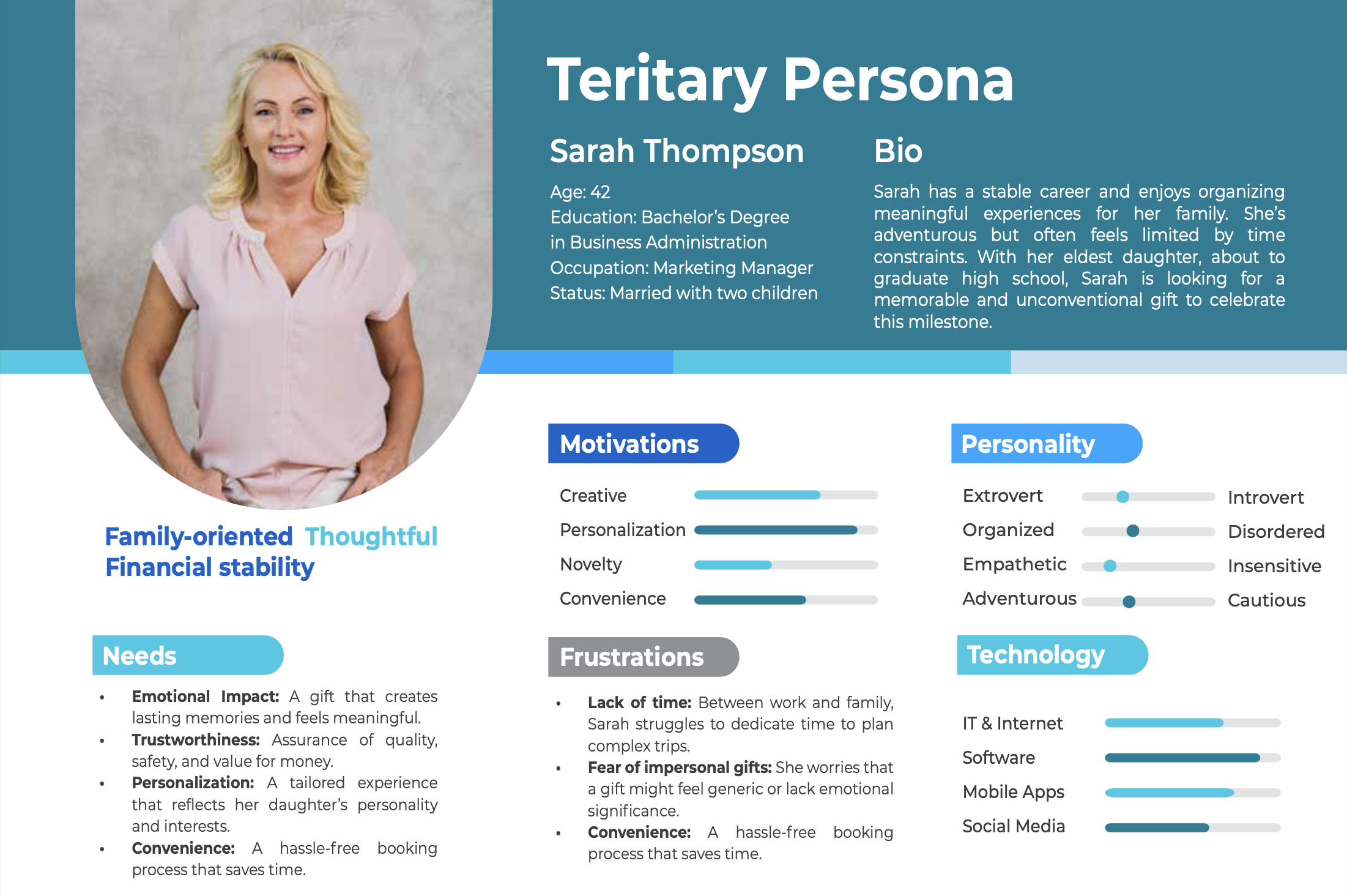
Persona
To address the problems identified, we developed three personas based on the client's target audience to better understand user needs, behaviors, and expectations. By defining the persona, we gained insights into how to improve Tripagog's content, visuals, and overall user experience to better communicate its value and connect with its audience.
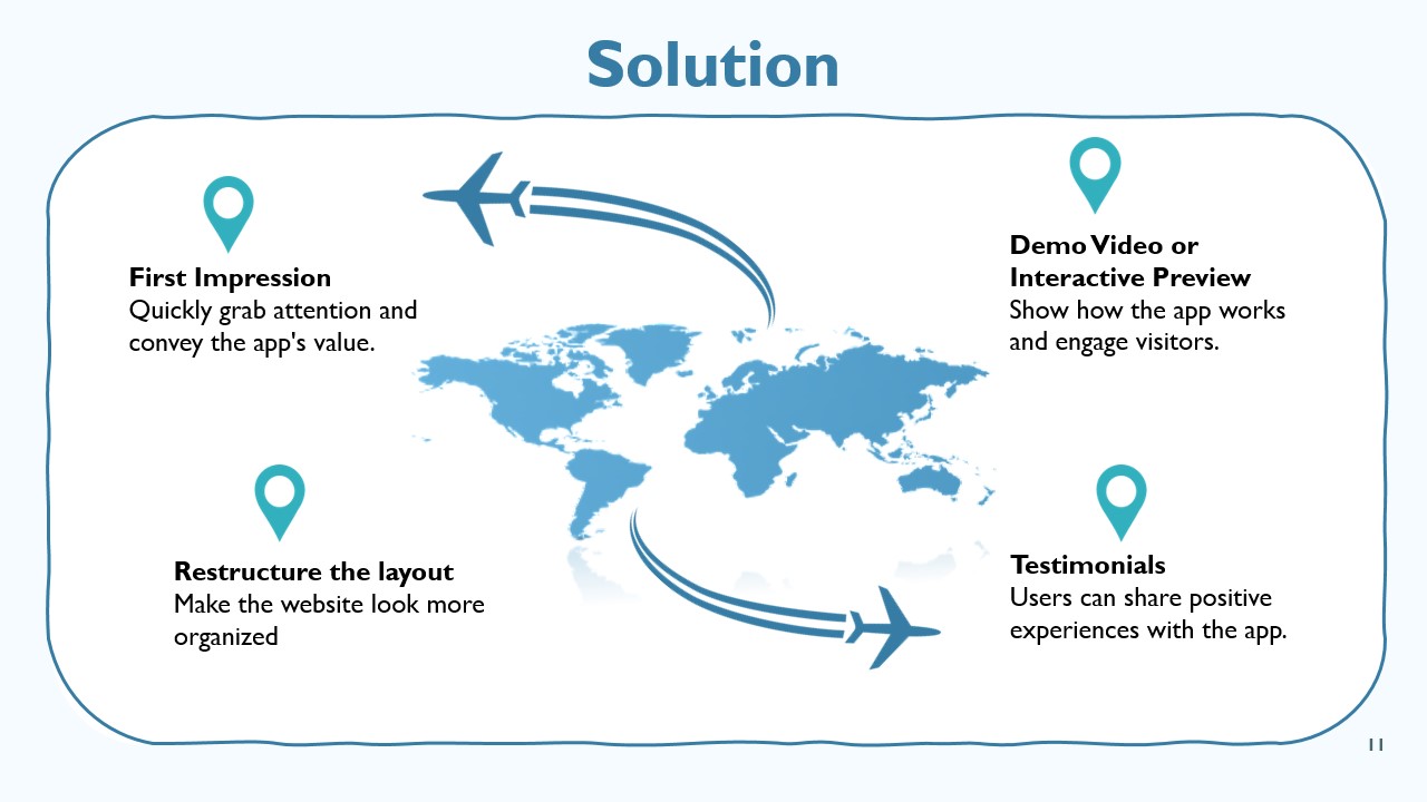
Solution
To address the identified issues, we developed a solution focused on clear messaging, engaging visuals, and informative content. We refined the website's structure to better showcase Tripagog's purpose, features, and benefits, ensuring users quickly understand its value.
Additionally, we suggested incorporating app screenshots, demo videos, and user testimonials to build trust and improve engagement.
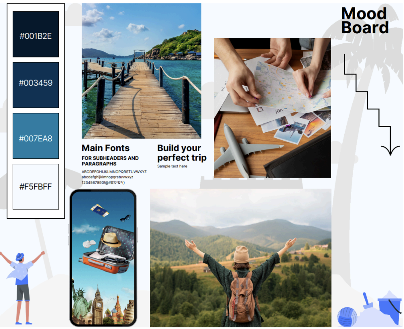
Sitemap and Moodboard
To structure the website effectively, we re-created a sitemap, organizing content into clear sections that improve navigation and user flow. Alongside this, we designed a mood board to establish the website's visual direction, exploring color palettes, typography, and imagery to align with the brand's identity and enhance the overall user experience.
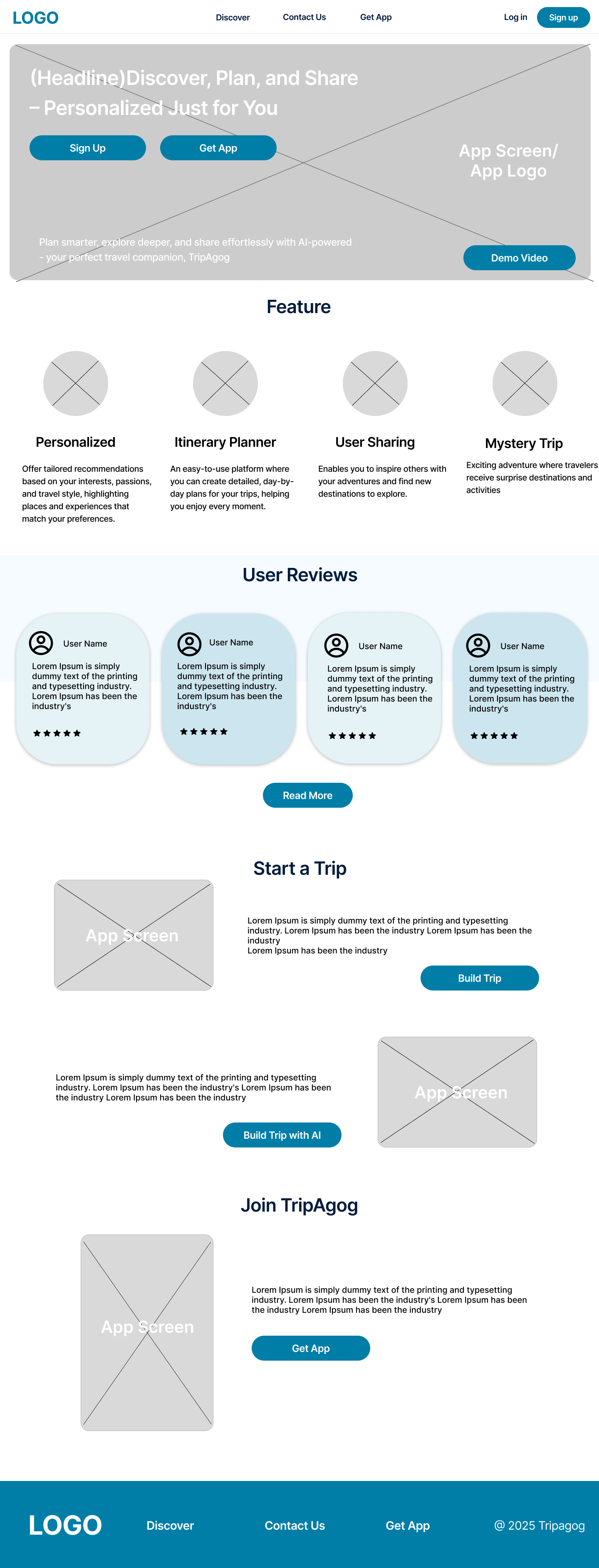
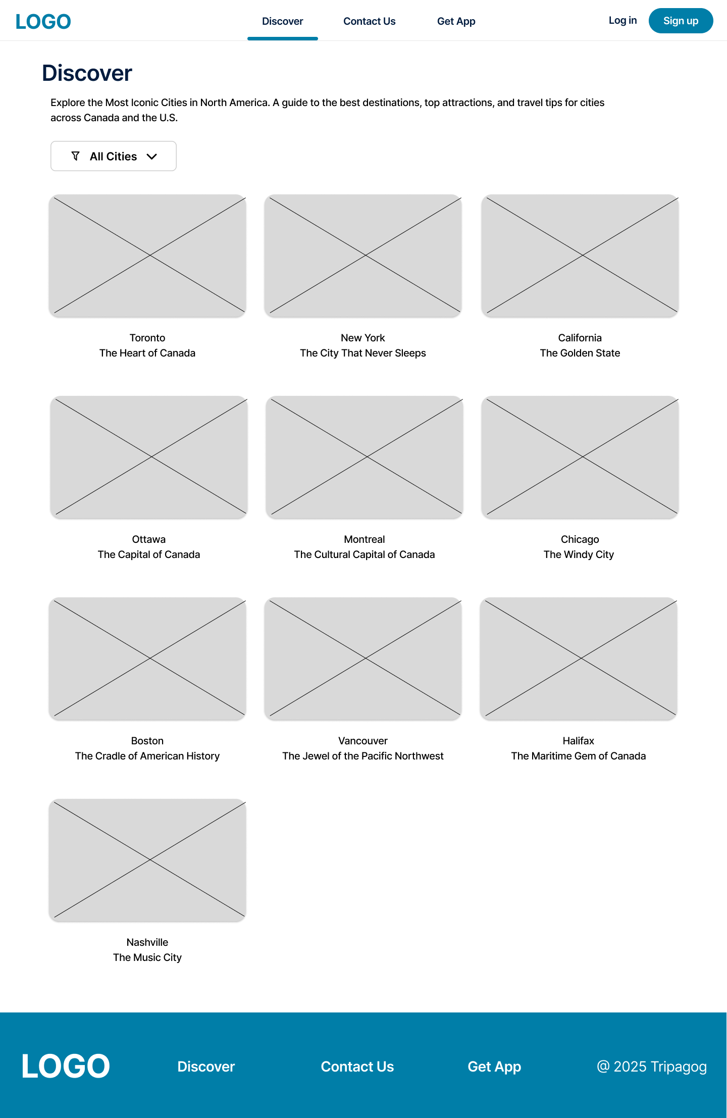
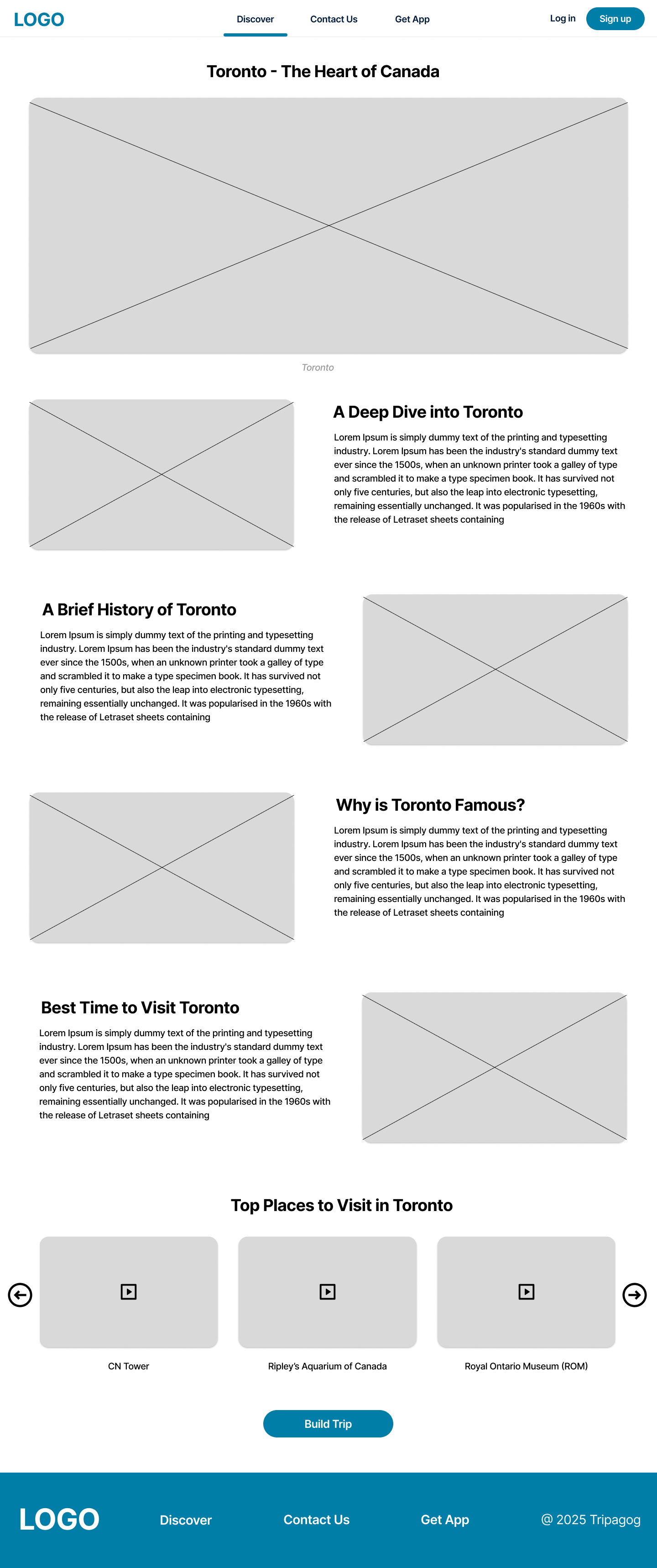
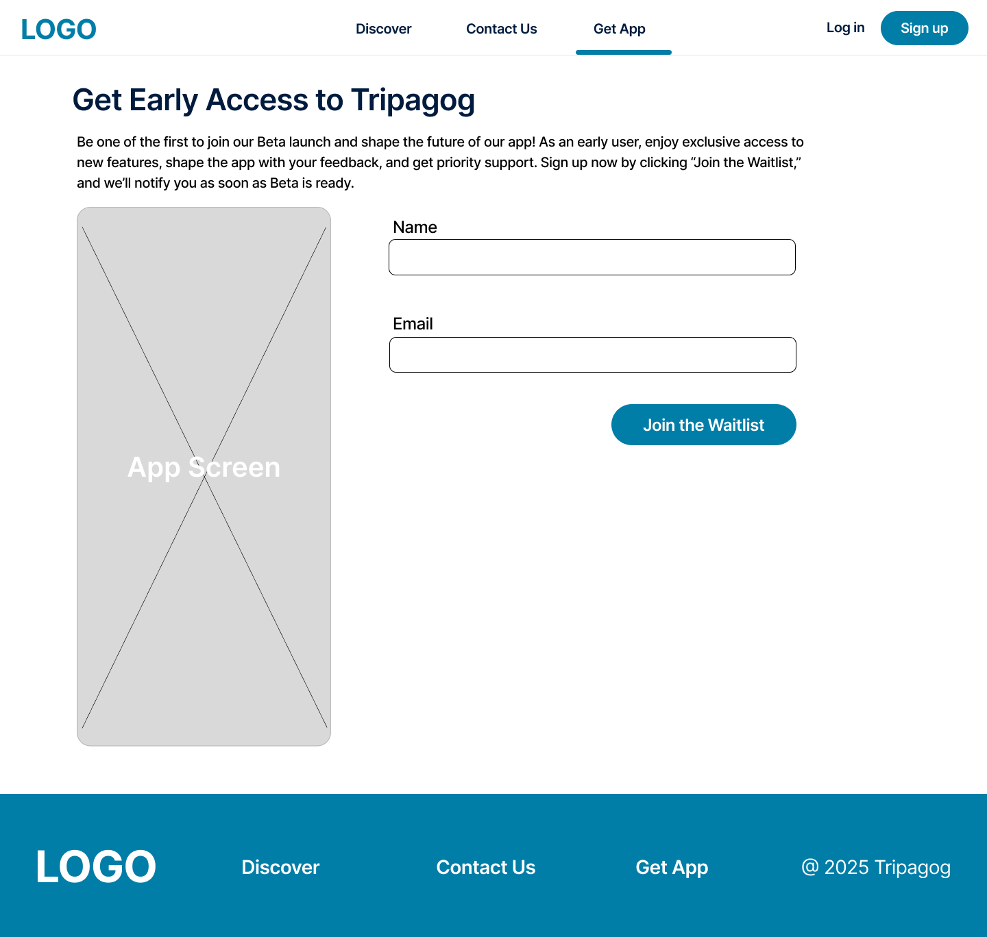
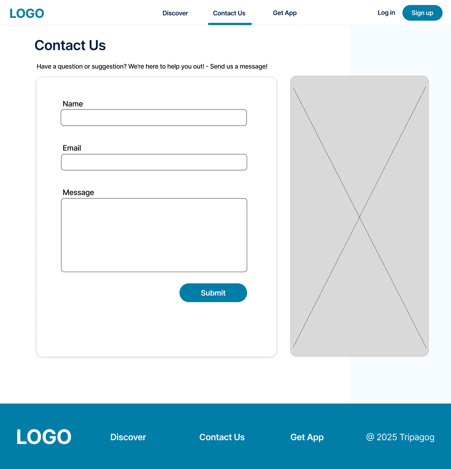
Lo-Fi Wireframes
Building on the sitemap and moodboard, we created low-fidelity wireframes to map out the website's structure, navigation, and content placement.
Usability Test
We conducted a Maze usability test to evaluate how easily users could join the waitlist, navigate the website, and find key content. A total of 18 participants took part in the test.
Overall, the website performed well in usability, with users able to complete key tasks successfully. Minor refinements in navigation clarity will be implemented in the high-fidelity design to enhance the user experience.
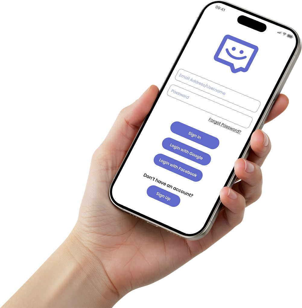
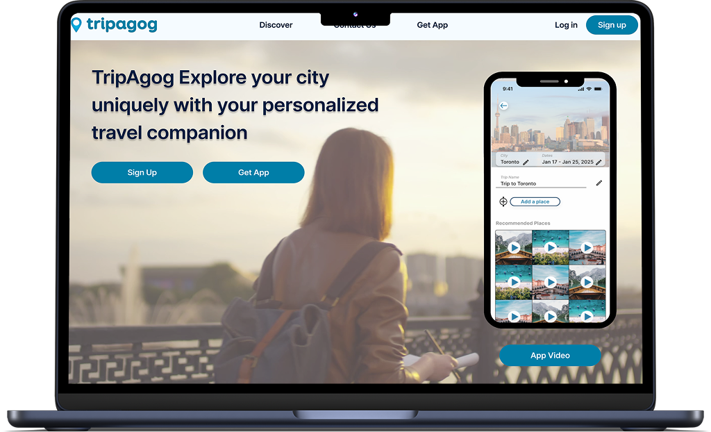
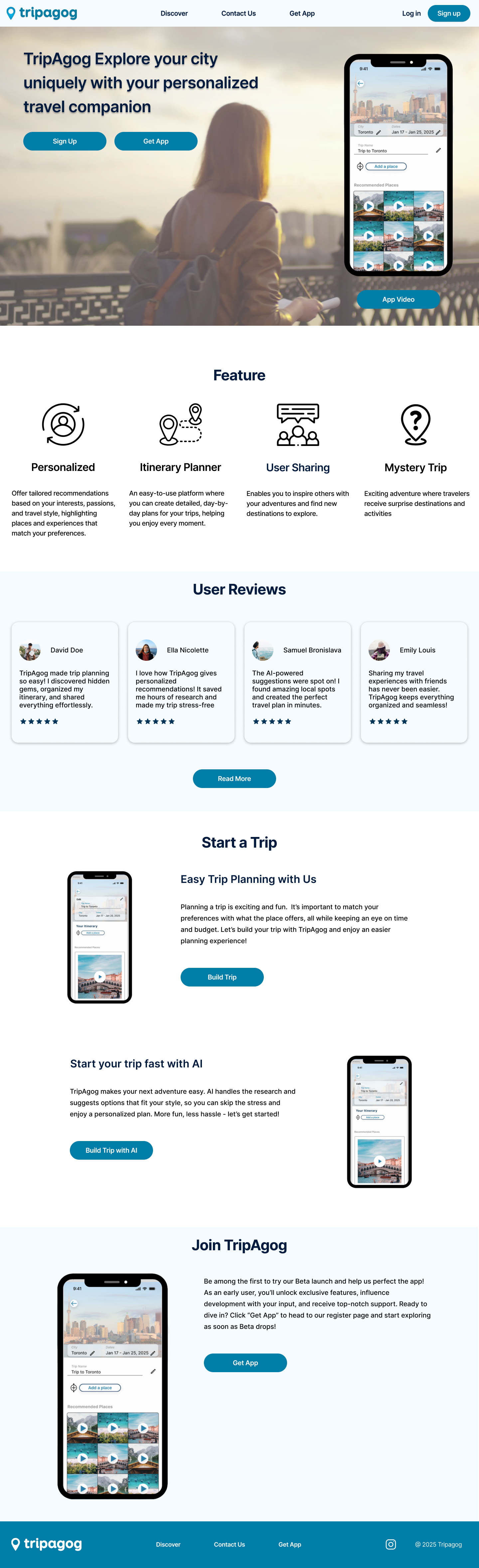
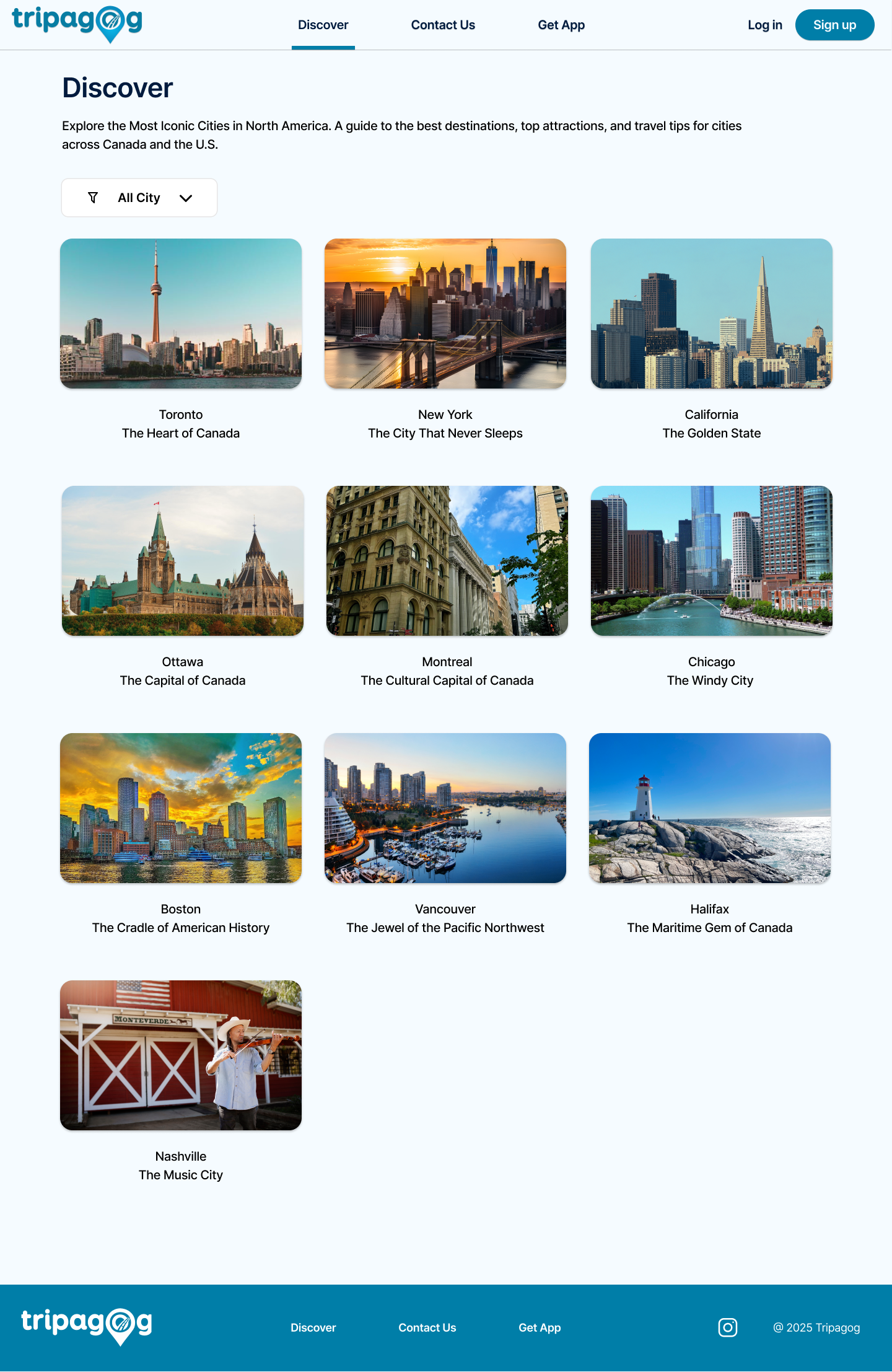
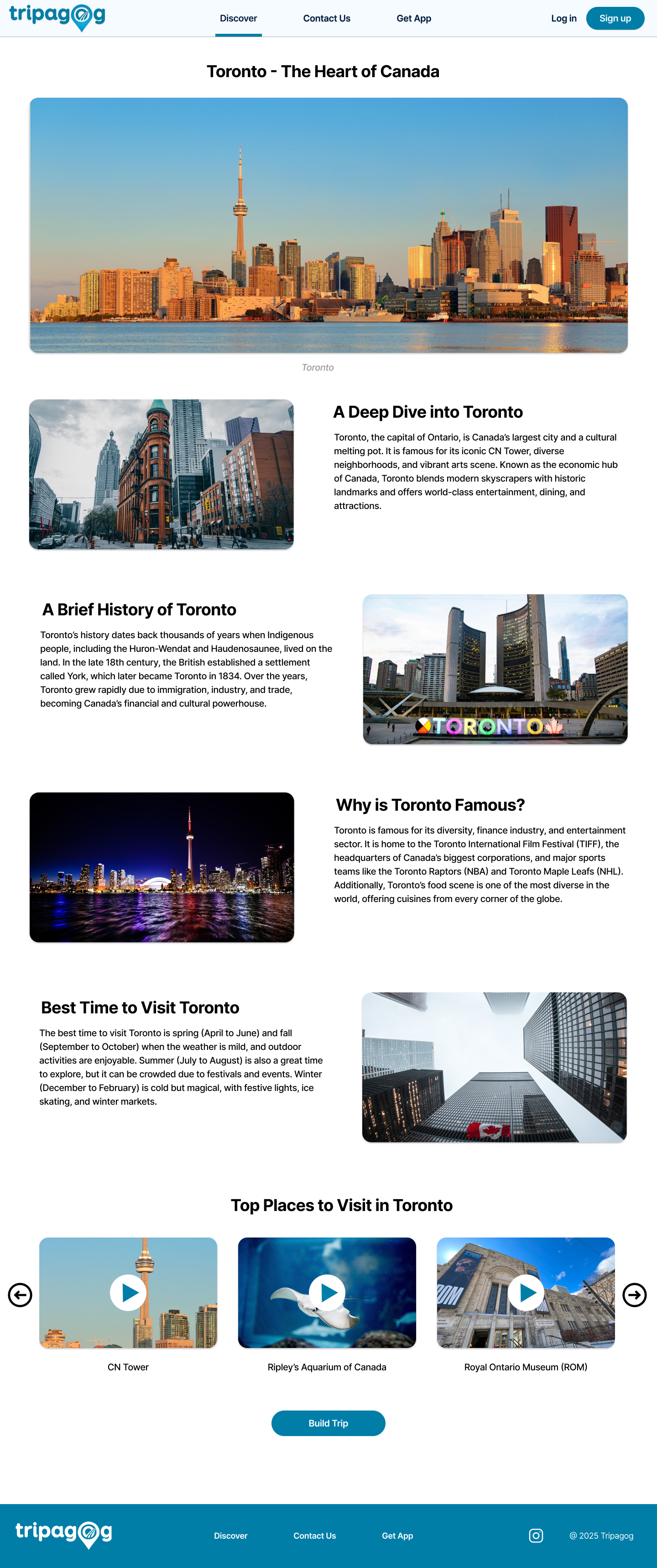
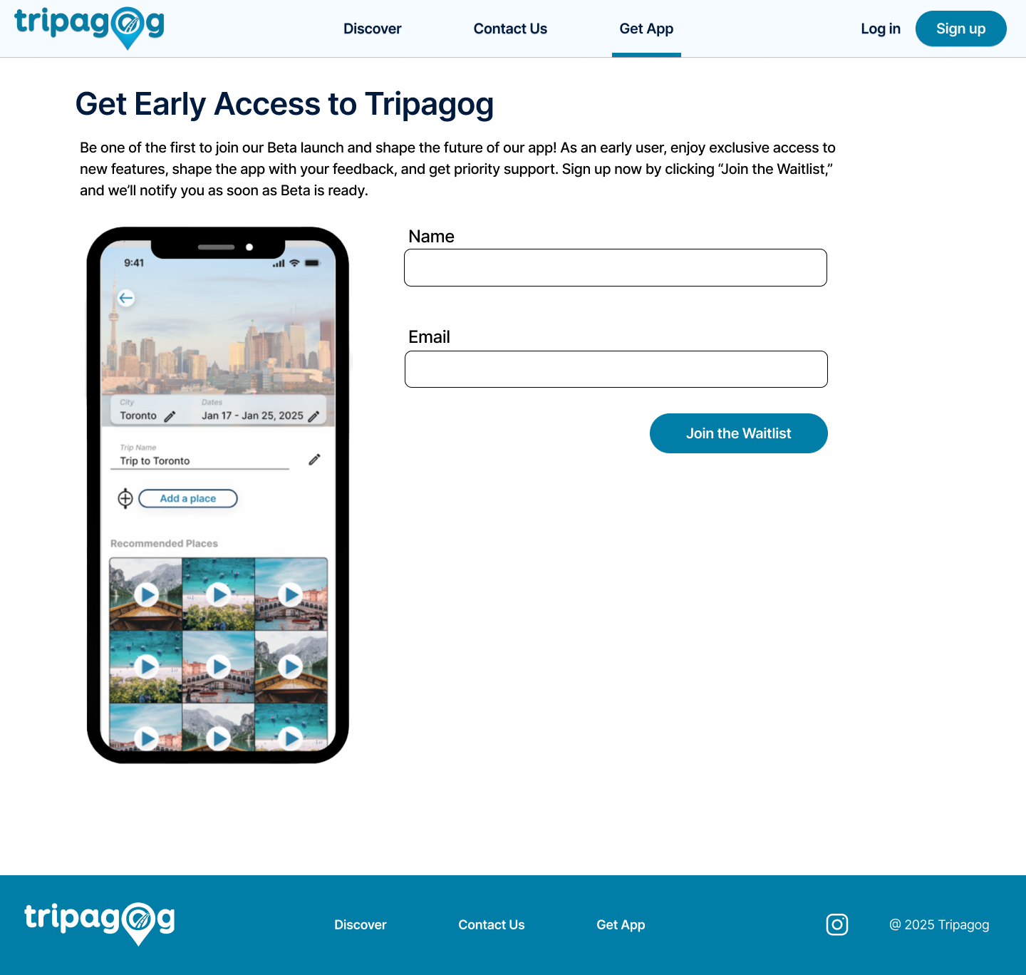
High-Fi Wireframes & Logo
The final high-fidelity designs incorporate all the insights from our research and testing, creating a visually appealing and user-friendly website that effectively communicates Tripagog's value proposition.
Key Takeaways
Research-Driven
Competitive analysis and user research informed all design decisions.
Usability Focused
18 participants validated the design's effectiveness and ease of use.
Real Client Impact
Delivered actionable solutions for business growth and user engagement.