Mindmate
Mental Health App
A comprehensive UX/UI case study for a mental health support app designed to provide a safe and accessible space for individuals struggling with stress and anxiety.
Project Overview
This project focuses on creating a mental health support app designed to provide a safe and accessible space for individuals struggling with stress and anxiety. Our research showed that users need a platform to express their feelings and concerns as a way to manage their mental well-being.
Software
Figma, FigJam, Maze
Role
UX Research, UI Design
Team
5 people
Duration
Fall 2024
User Statement
Many individuals struggle with stress and anxiety but often lack a safe, accessible space to express their feelings and find support. Without a proper outlet, these emotions can become overwhelming, negatively impacting mental well-being.
Our app aims to bridge this gap by providing a secure and judgment-free platform where users can share their thoughts, connect with supportive communities, and access mental health resources—all while maintaining their privacy and comfort.
Focus Group Interview
To understand user attitudes towards mental health apps, we conducted a focus group interview exploring app usage, stress management, comfort in sharing, and desired features.
Low App Awareness
None of the participants had used or heard of mental health apps, highlighting the need for user education in onboarding.
Privacy Concerns
Hesitation to share personal feelings on digital platforms, emphasizing the importance of anonymity and strong privacy protection.
Design Preferences
Strong preference for soft, calming colors and a simple, uncluttered layout to avoid overwhelming users.
Emotional Support
Users expressed need for both peer support and professional guidance in managing mental health challenges.
User Journey
After gathering insights from our focus group and defining our user statement, we mapped out the user journey to better understand how users would interact with the app.
User Flow
Building on the user journey, we created a user flow to define the specific steps users take to navigate the app. We structured the flow to be simple and intuitive, ensuring that users can easily access support and resources without feeling overwhelmed.
The process starts with onboarding, where users are introduced to the app's features and can choose to remain anonymous. From there, they can log feelings in a journal, explore self-help resources, or connect with peer and professional support.


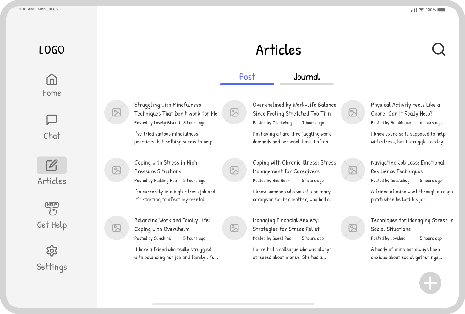
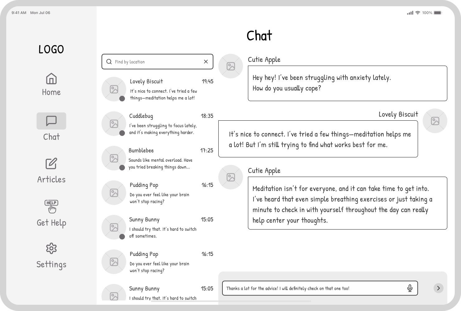
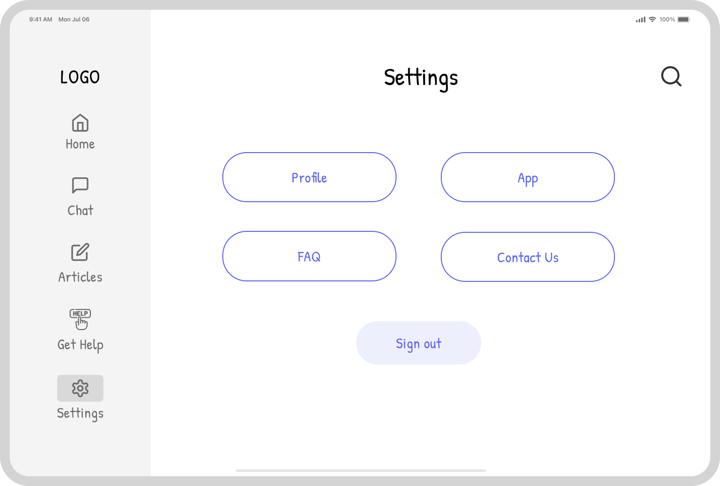
Sitemap
To ensure a clear and intuitive navigation structure, the app's sitemap is designed for clear navigation, comprising four key sections:
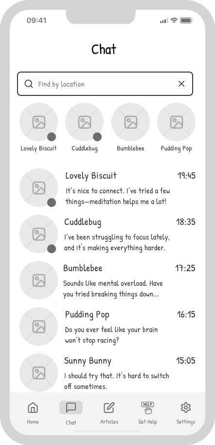
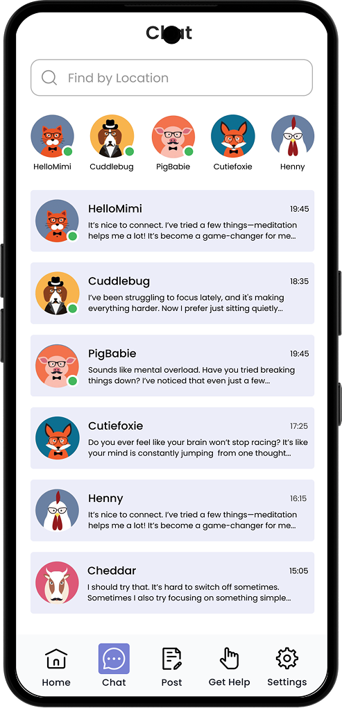
Chat
A safe space for anonymous or group connection, fostering supportive dialogue.
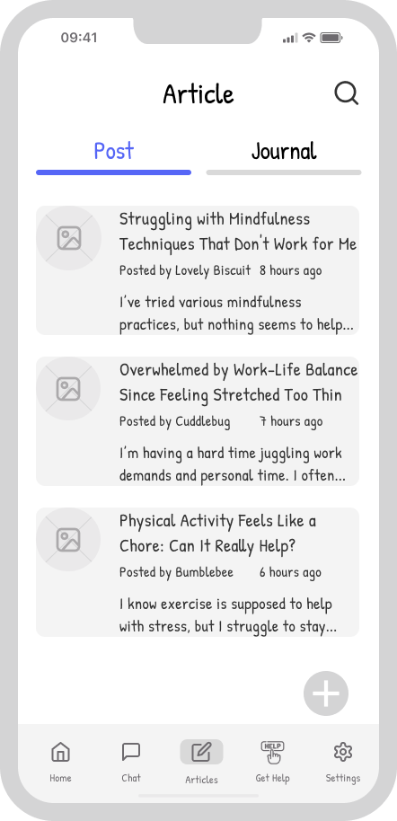
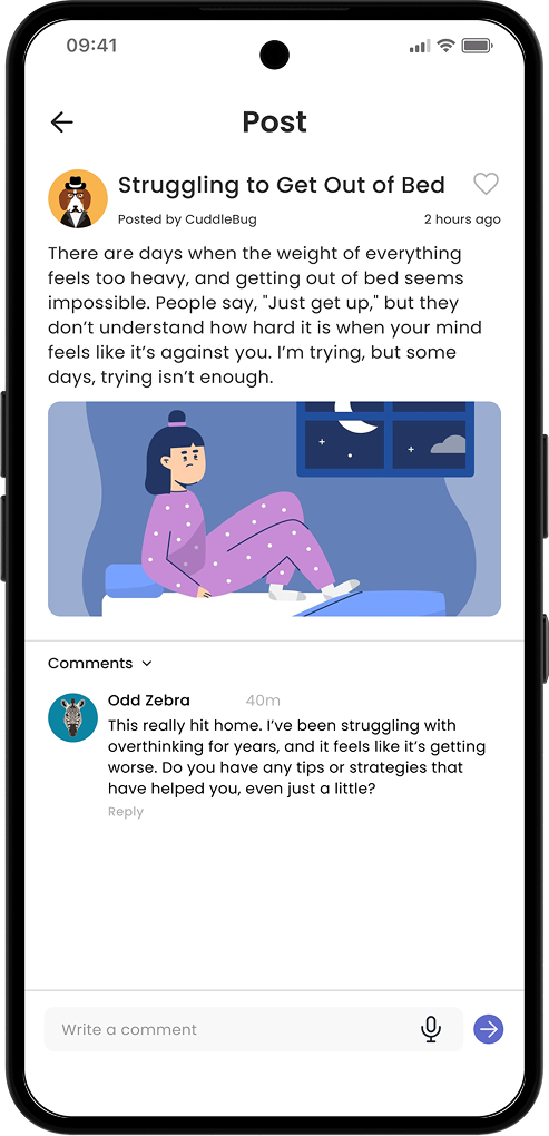
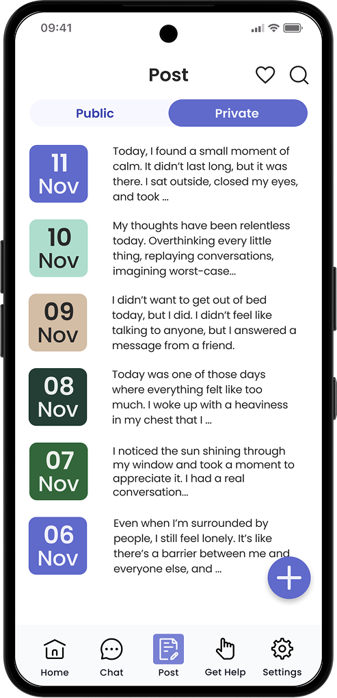
Post
A creative outlet for sharing journal entries and public posts within the community.
Get Help
Direct access to mental health resources, professional assistance, and crisis support.
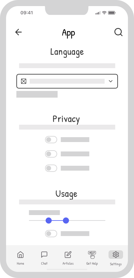
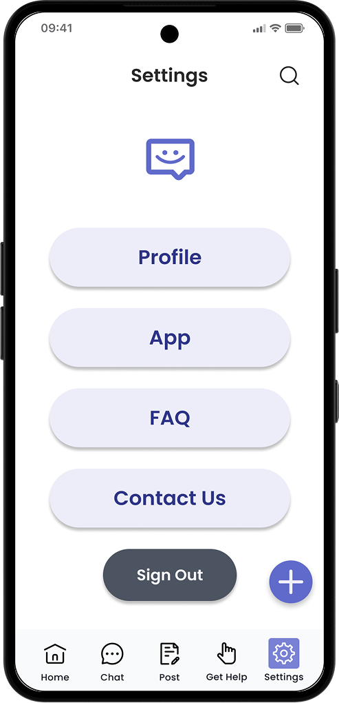
Settings
Comprehensive control over preferences, privacy, and notifications.
Moodboard
Our moodboard focuses on creating a calm and reassuring atmosphere for users. We chose a color palette centered around soft, muted tones to evoke feelings of relaxation and emotional balance, along with neutral tones to maintain a clean and modern look.
Low-Fidelity Wireframes
To define the app's structure and layout, we designed low-fidelity wireframes for both mobile and tablet versions, focusing on navigation, content placement, and user interactions.
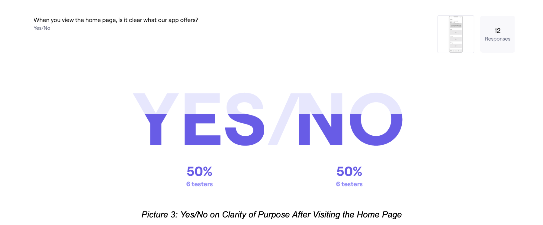
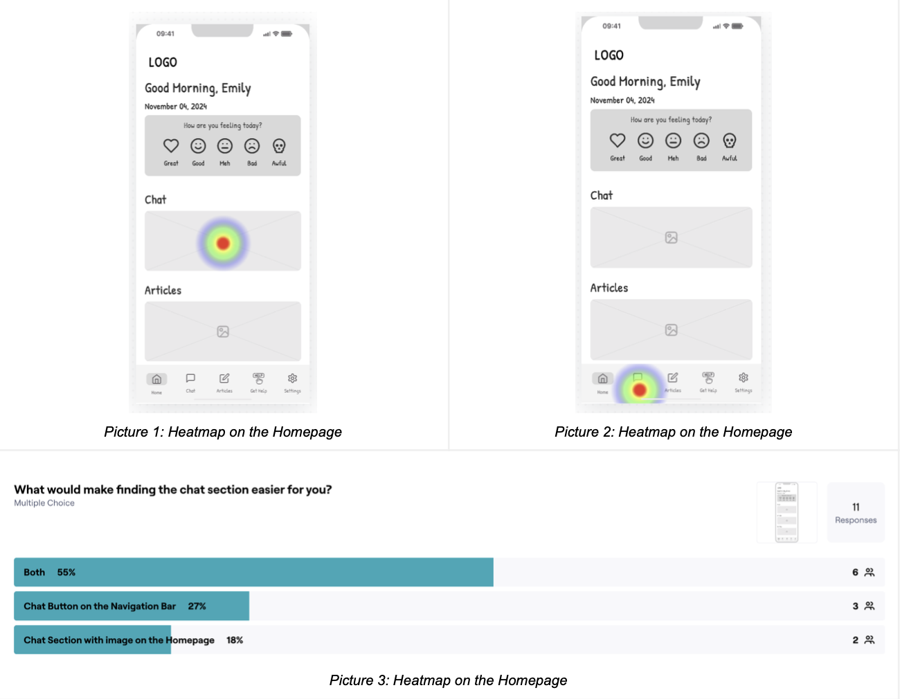
Usability Testing
Our usability testing provided valuable insights into how users interact with key features of the app. While the sign-up process proved intuitive, the homepage lacked clarity, requiring improvements in onboarding.
Positive Findings
The sign-up process proved intuitive and the chat function was easy to find.
Areas for Improvement
The homepage lacked clarity, requiring improvements in onboarding. Users had privacy concerns regarding location sharing.
Next Steps
Refine high-fidelity designs by enhancing onboarding clarity, improving navigation labels, and addressing privacy concerns.
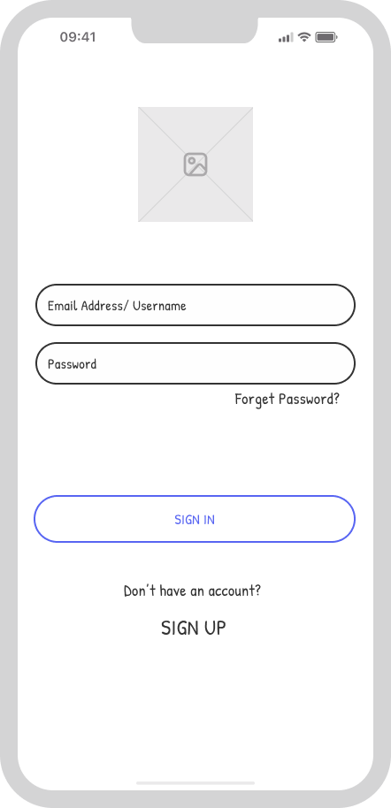
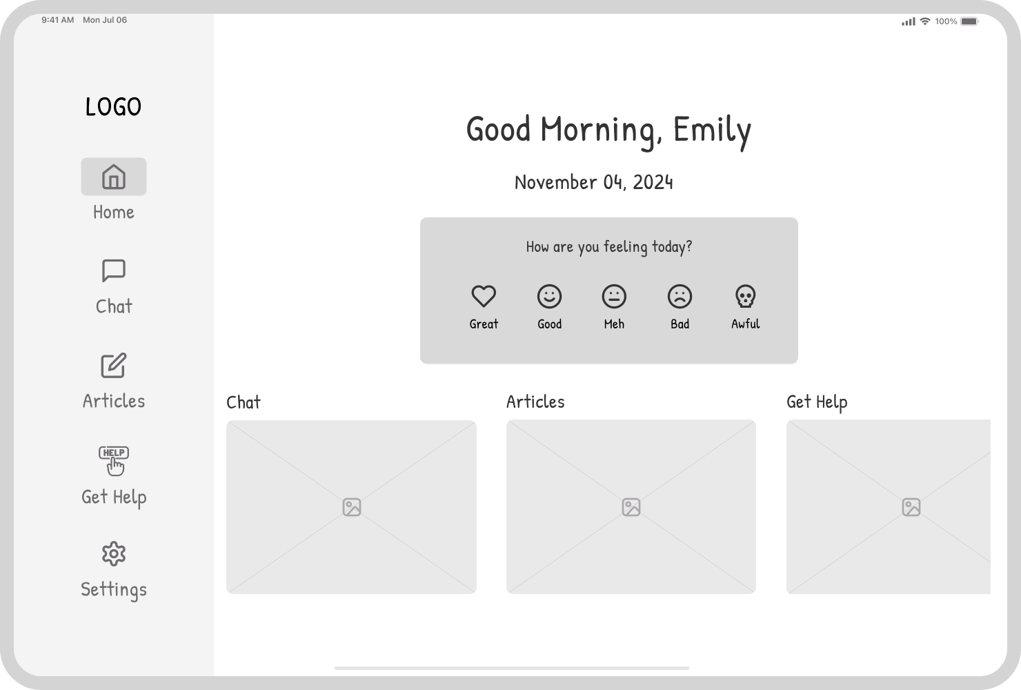
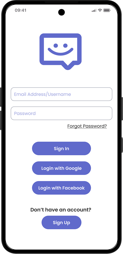
High-Fidelity Wireframes
Moving into high-fidelity design, we refined the visuals by incorporating colors and typography. We also refined key elements based on the usability test results, improving navigation, clarity, and accessibility to enhance the overall user experience.

Key Takeaways
Privacy First
Users prioritize anonymity and privacy protection when sharing personal feelings.
Calming Design
Soft colors and simple layouts are essential to avoid overwhelming users.
Community Support
Users value both peer and professional support options in mental health apps.